2.6 Conditionally revealed radio inputs could be made clearer (Positive)
2.6.1 WCAG 1.3.1 (A), 4.1.2 (A) - Desktop, Mobile, Automated Finding, iPad
Throughout the service, certain radio buttons reveal a secondary input field when selected. For example, choosing ‘Yes’ on the Visits and Care page reveals a secondary input stating “How is the care funded?”.
Visually, the dynamic behaviour is clear as the input appears immediately after selection. However, this change is not reliably communicated to screen reader users. As a result, blind or visually impaired users may not realise that new fields have appeared and may miss important form inputs.
Although aria-expanded is used on these radio inputs to indicate an expandable area, it is not valid on native <input type="radio"> elements. This causes inconsistent support: for instance, only NVDA with Firefox reliably announces the expanded/collapsed state. Other screen reader and browser combinations either ignore aria-expanded or raise errors.
Also note that automated accessibility checkers like Accessibility Insights flag the use of aria-expanded within an <input> tag as an invalid syntax. This is because the aria-expanded attribute is only valid for specific element types with roles that involve expansion and contraction, like menus, dialogs, and accordion panels. <input> elements without explicitly assigned roles typically have the default role of “textbox,” which is not included in the list of valid roles for aria-expanded. Not using HTML according to specification could affect the automated accessibility score of the website.
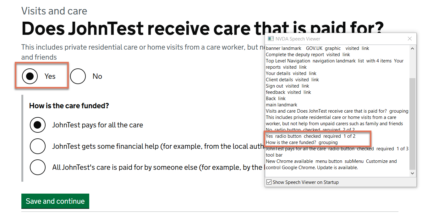
FIGURE 2.9: Expandable radio inputs on Visits and Care page
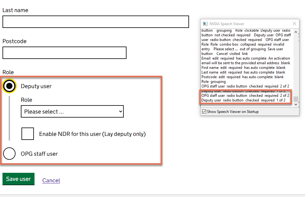
FIGURE 2.10: Radio buttons highlighted with NVDA speech viewer on the Add New User page
2.6.2 Code Snippet
<div data-target="how-care-funded-wrapper">
  <input type="radio" id="visits_0"  aria-expanded="true">
      <label for="visits_care_doesClientReceivePaidCare_0">
            Yes
      </label>
</div>
2.6.3 Recommendation
We recognise that the accessibility of conditionally revealed questions has been flagged by the GOV.UK Design System team. We also believe that informing all users of the expanded and collapsed state would be beneficial, and recommend continuing to reach out to the ARIA working group to add support for this behaviour.
Meanwhile, we recommend adding a visually-hidden <span> element to the label that informs screen reader users of the secondary input, such as:
<div data-target="how-care-funded-wrapper">
  <input type="radio" id="visits_0"  aria-expanded="true">
      <label for="visits_care_doesClientReceivePaidCare_0">
            Yes
<span class="govuk-visually-hidden">
    Selecting this will reveal an additional input
  </span>
      </label>
</div>
2.6.4 Spot Check: February 2026
This issue has been resolved. The fields make use of a visually hidden span that informs users that an additional input will be revealed.
This has been updated from a ‘Low’ severity issue to a ‘Positive’ finding.