2.7 Presentation of radio buttons could be confusing (Positive)
2.7.1 WCAG 1.3.1 (A), 3.3.2 (A), 4.1.2 (A) - Desktop, Mobile, iPad
On the Money In and Money Out pages, radio buttons are visually grouped under headings such as “Salary or wages”, “Income from interest, investments, or property”, and “Pension”, creating the impression that each group is a separate radio group from which a user can select one option. This is compounded by the message by the instructional text on the previous screen (“Enter a total amount or individual amounts for each type of income”) , which implies that users may enter multiple types of income.
This is especially problematic for screen reader users. As shown in the screenshot, NVDA announces “Salary or wages, radio button, 1 of 1”, which implies there are no other choices. This happens because the radio buttons are not grouped in a single <fieldset>, and so the screen reader cannot determine the full set of options. Furthermore, because these are radio buttons, pressing Tab moves the focus to the “Continue” button after the first option, reinforcing the incorrect impression that no other choices exist.
This design may lead users to miss options or misunderstand how to correctly interact with the form.
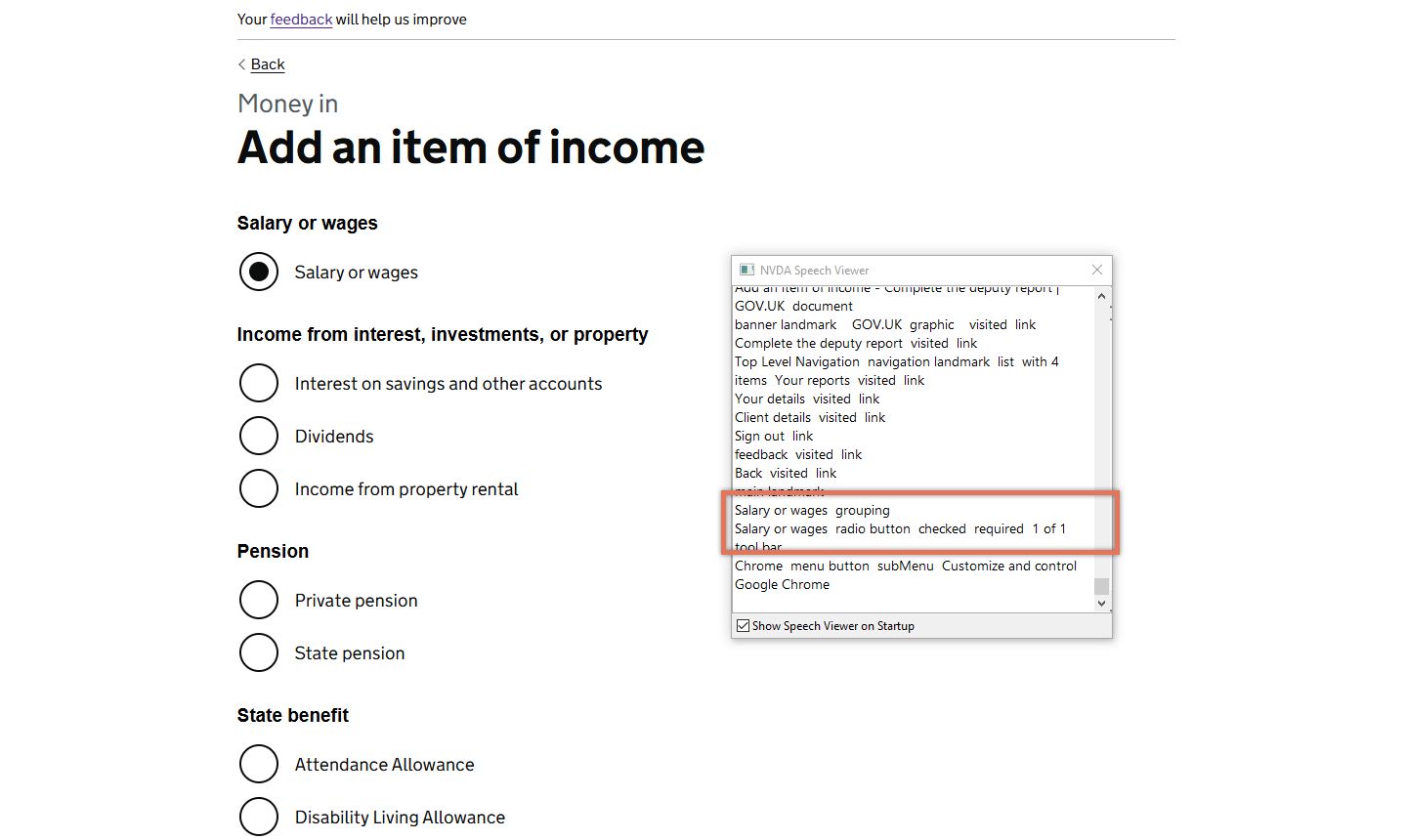
FIGURE 2.11: Screenshot of Money In radio options and screen reader output
2.7.2 Recommendation
Group all radio buttons within a single <fieldset> and use a <legend> that clearly states only one option may be selected. This will ensure screen readers announce the total number of options correctly.
If visual grouping is important, consider using headings or separators within the fieldset, while maintaining a single radio group from a semantic point of view. Optionally, introduce hierarchical or expandable radio buttons. For example, a top-level option like “Income from interest or property” could reveal further options such as “Interest on savings”, “Dividends”, and “Income from property rental” when selected.
2.7.3 Spot Check: February 2026
This issue has been resolved. All radio buttons are now grouped within a single <fieldset> with a clear legend (“Money in, Add an item of income”). The options are announced as part of one group (for example, “1 of 26”), making it clear how many choices are available and that only one can be selected.
This has been updated from a ‘Medium’ severity issue to a ‘Positive’ finding.