3.1 Summary answers on Check Your Report page are unclear for screen reader users (High)
3.1.1 WCAG 1.1.1 (A), 1.3.1 (A) - Desktop, Mobile, iPad
On the Check Your Report page, the answers from previous form steps are presented in a static summary sheet. For Yes/No questions, these summaries are coded using layout tables. This causes screen readers such as NVDA to announce the information in a way that is difficult to follow.
For example, for the question “Does JohnTest receive care that is paid for?”, NVDA announces:
“Column 1: X, Column 2: Yes, Column 3: [blank], Column 4: No.”
Users must interpret that the “X” in column 1 means Yes is the selected answer. The reading order and the reliance on a separate “X” marker make it harder to connect the answer to the question.
For multi-option questions, the summary is not in a table but still presents problems. The selection marker (“X”) is announced separately from the option label, so users have to piece together which items are marked as selected. For instance, the answers to the question “How is the care funded” would be announced as “X; John pays for all the care; John gets some financial help; Paid for by someone else”. Users would have to identify which label the X corresponds to to understand which option was picked.
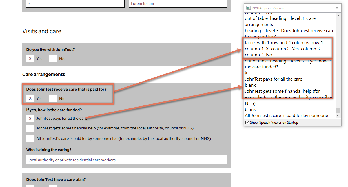
FIGURE 3.1: Answers summary on Check Your Report page
3.1.2 Recommendation
Replace the current table-based and icon-based layout with semantic HTML that directly represents the relationship between each question and its answer. This will ensure that assistive technologies present the information in a meaningful, linear way.
Possible approaches include:
Use a definition list (
<dl>): Place each question in a<dt>and its corresponding answer in a<dd>. This creates a clear, programmatic association that is announced as “Question: Answer” by screen readers.<dl> <dt>Does JohnTest receive care that is paid for?</dt> <dd>Yes</dd> </dl>Use the GOV.UK Summary list component: This is specifically designed for presenting key–value pairs of information in a way that works well with assistive technologies. Each row contains a label (question) and value (answer), with optional actions like “Change” if the answer can be edited.
<dl class="govuk-summary-list">
  <div class="govuk-summary-list__row">
    <dt class="govuk-summary-list__key">
      Does JohnTest receive care that is paid for?
    </dt>
    <dd class="govuk-summary-list__value">
      Yes
    </dd>
  </div>
</dl>
For multiple-choice answers: Update the accessible label to include which option was selected without relying on a separate symbol like an “X”. For example,
Selected: John pays for all the care.
If keeping the ‘X’ for sighted users, combine it with visually hidden text so screen reader users hear both the option name and the fact it was selected. For example:
<span aria-hidden="true">X</span>
John pays for all the care
<span class="govuk-visually-hidden"> selected</span>
3.1.3 Resources
3.1.4 Spot Check: February 2026
This issue has not been resolved. The summary still uses a table-based layout, leading to confusing screen reader announcements.
While we understand this functions as a PDF-style page intended for printing, this is currently the only screen where users can review their answers before progressing. There is no alternative review screen, which is why we recommend providing an HTML summary that implements one of the suggested approaches. The PDF view could then remain as an alternative for users who need it, rather than the sole way of accessing this information.
This remains a ‘High’ severity issue.